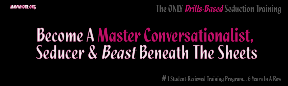
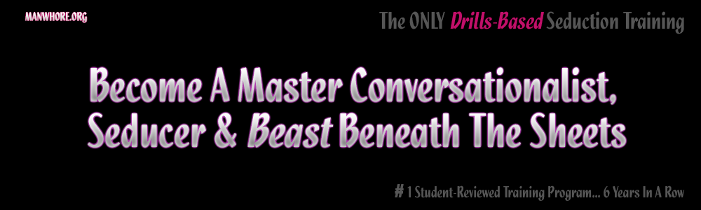
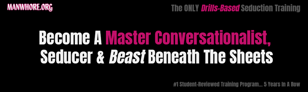
Which one you think is sexy, coolest?

I go in and I'm crisp, clean and my vocals are fucking coming out like music. - Anonymous MW student
- Autismus Terminus Finis (Root Cause/Cure of Autism Epidemic)
- Called Off My Wedding & Other Turn Tail Signs Of The American Male

I like them all, but #3 pops the most to me
Really? The bottom one?
I go in and I'm crisp, clean and my vocals are fucking coming out like music. - Anonymous MW student
- Autismus Terminus Finis (Root Cause/Cure of Autism Epidemic)
- Called Off My Wedding & Other Turn Tail Signs Of The American Male
3rd
i have to say the 3rd.Looks cleaner and pops better with that white

agree with the others, readability matters a lot when it comes to copy. Cleaner fonts and better contrast always come out as the winner.
Anyways, I think this is a very small part (and later stage) of the optimization.
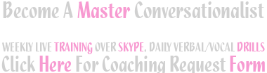
Is master conversationalist your biggest selling point that draws guys in? What words do they use when they fill out the form?
I like #1 the best but the 3rd pops and catches the eye better. If you get rid of the pink outline around the white words of the 1st one, that'd be my pick.
So you like the font of the first one better but don't like the pink/red tinge?
Dammit no one likes the artistic, meaningful look! It's all got to "POP". Lol. No artistic integrity anymore :'( haha
I like #1 the best but the 3rd pops and catches the eye better. If you get rid of the pink outline around the white words of the 1st one, that'd be my pick.
I go in and I'm crisp, clean and my vocals are fucking coming out like music. - Anonymous MW student
- Autismus Terminus Finis (Root Cause/Cure of Autism Epidemic)
- Called Off My Wedding & Other Turn Tail Signs Of The American Male
They don't use a lot of words at all, lol. These are the main selling points to me. Haha
agree with the others, readability matters a lot when it comes to copy. Cleaner fonts and better contrast always come out as the winner.Anyways, I think this is a very small part (and later stage) of the optimization.
Is master conversationalist your biggest selling point that draws guys in? What words do they use when they fill out the form?
I go in and I'm crisp, clean and my vocals are fucking coming out like music. - Anonymous MW student
- Autismus Terminus Finis (Root Cause/Cure of Autism Epidemic)
- Called Off My Wedding & Other Turn Tail Signs Of The American Male
So the 1st and 3rd ones I designed, my buddy (a multi-millionnaire web programmer/developer) designed the middle one. I don't like the 3rd one y'all seem to like. Someone told me it looked like Impact font which really rubs me wrong haha. This is a seduction training program, the MEME font (Impact) is not what I'm going for. Plus it just looks too square. In fact the font is the most intricate part here. I've attempted to find the right font for years and I keep coming back to the one used in the 1st and 2nd. It's strong and masculine while also a bit fancy, and also has a nice structural, slightly off-center, flair.
But the 1st one is still too square to me, not soft enough. The middle one is the only one where he managed to actually soften the edges and make it look slightly rounded.. that's hot. Thoughts?
I go in and I'm crisp, clean and my vocals are fucking coming out like music. - Anonymous MW student
- Autismus Terminus Finis (Root Cause/Cure of Autism Epidemic)
- Called Off My Wedding & Other Turn Tail Signs Of The American Male
If i had to choose between 1st and 2nd i would go with 2nd.That pink fuzz seems a bit over the top.That way you get the more jiggy look and not so square as the 3rd one.
I m not a guru on this shit but if you would ask me i think trends change constantly when it comes to landing pages and logos and all that.Remember when the ads revolution took place and people started to get less and less traffic because we developed a trigger response to sites that were too spammy and full with ads.Thats when tactics had changed.
Also...i dont know if its only me but the Grant Cardone xx7$ prices and selling page structure is also on its end.I m sure it had its glorious days but again...people have been feed too many spammy pages with this type of structure and it might also start to cause that trigger of SPAM.But i might be wrong.Just my pov.
I think content & platform is king when it comes to social media.I am more then sure that if you keep your fanbase close and interact with them(youtube,facebook,podcasts) they will convert into good leads . Jab jab jab right hook .
Bro, I get triggered when anyone talks about "converting my fanbase into leads". I fucking hate that sales shit. I am trying to make something beautiful, that conveys the message in feel and intensity, as well as its literal message. (Plus I run the best training program on the planet. I ain't worried about underfulfilling)
Pink fuzz seems over the top? :( Do you see something like it over the top somewhere else? Is it a gut reaction? Are you just being homophobic? (That's fine, I just need to know, lol)
I go in and I'm crisp, clean and my vocals are fucking coming out like music. - Anonymous MW student
- Autismus Terminus Finis (Root Cause/Cure of Autism Epidemic)
- Called Off My Wedding & Other Turn Tail Signs Of The American Male
Not homofobic..damn:))Just a gut reaction.Its strictly related to this case.I like pink( wink wink) I have a t shirt with pink flamingos :))ha
Hmm 'k thanks. What about the use of pink in general? Like in the bottom one. Think that's too much pink too? Takes away from the message? Or do you think it helps it?
I go in and I'm crisp, clean and my vocals are fucking coming out like music. - Anonymous MW student
- Autismus Terminus Finis (Root Cause/Cure of Autism Epidemic)
- Called Off My Wedding & Other Turn Tail Signs Of The American Male
I think it looks good and its better to have a highlighted part of text instead of just one color for all the words.Also its the way you underline some aspects of your program.Hope it helps:)

I like the first and 2nd. 2nd one is my favorite. 1st and 3rd seem kinda try hard. 2nd one just looks clean and sexy
3rd one looks like I went into word and pulled up the biggest pic art font I could find ha!
@manwhore - what are you tryna achieve with these banners? Are these gonna be clickable and send people to a signup page or something? Can you just do some A/B testing and segment out which one appears for different Groups of IP addresses and keep everything else the same then just measure which gets the best resultt
worked with the marketing team at the last company I worked at who just went public and we'd do that shit for our landing page - you can get real specific and have different versions pop up for various groups of visitors