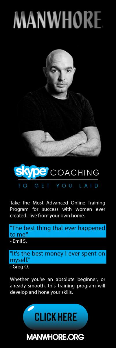
Feedback on your ads.
Thu, 04/23/2015 - 15:07
The ads that pop up when we land on the front page (manwhore.org) suck.
The policy is ugly and not much readable. The mix of color blue add whackyness to the mix.
Play with theme of the amazing ads you got on the right and the policy there is also fabulous.

How can you produce something like this and then this shitty ads ?
Another thing and that is major + you will dig it. Put photo of real girls that you fuck. Why ? No one in the community do that and so you add credibility, own sense of style and awesomeness. Use you magical MS paint skills that you show off all the time on facebook to cover the identity of this girlie and your good to go.


