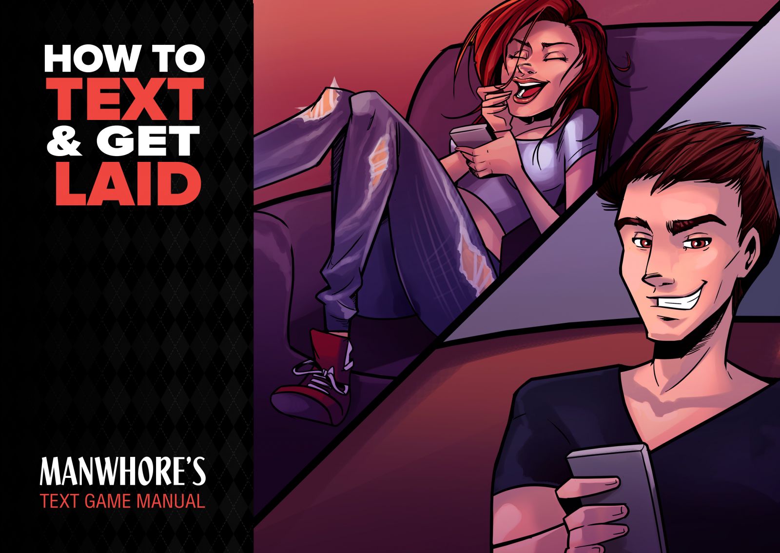
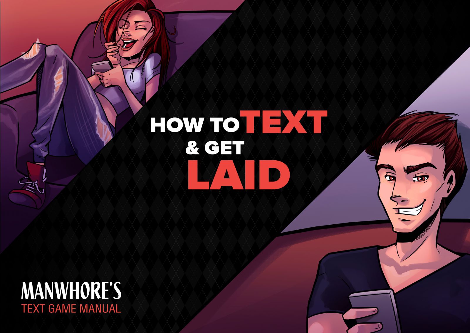
Latest Text Game Ebook Artwork


Second one slap your attention. Also the Burlington effect look more slick.
I like the second one. The distance between the guy and girl goes along with the form of communication
I liked the first. It was easier for my eyes to take it all in with one glance.
I like the first as well. It's like I want to turn the page and start reading lol
Wow I preferred the first just for "obvious" reasons, but you guys mentioning the second one had great points. Derp
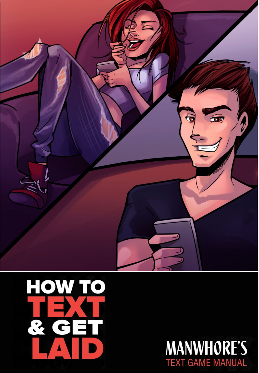
Either way, they both are too 'Wide' if you're planning on having an ebook cover. Or lets say you publish a physical copy, you'll want something longer. I just threw this together really quick to show you what I mean:

Yeah this is for "Gumroad". Ebook cover is coming next
I like the second one better, too. It does get the whole distance aspect across better and it's better to take in at one glance.
I feel the black bar in the middle is a little too wide, though.
Maybe you can experiment here a little with different proportions of the three parts of the cover. My intuition is that you can probably decrease the size of the middle bar a bit, and also the girl could be a little smaller. This leaves more room to increase the focus on the cheeky, self amused texting guy. Afterall he is the kind of the main dish here.
I guess in the end you will try out different sales page designs and see what works best anyway, won't you?
2nd


