NEED FEEDBACK! The ebook pdf page border/setup..
Ignore the content it's fucking terrible. Ha!
Which one do you like best?

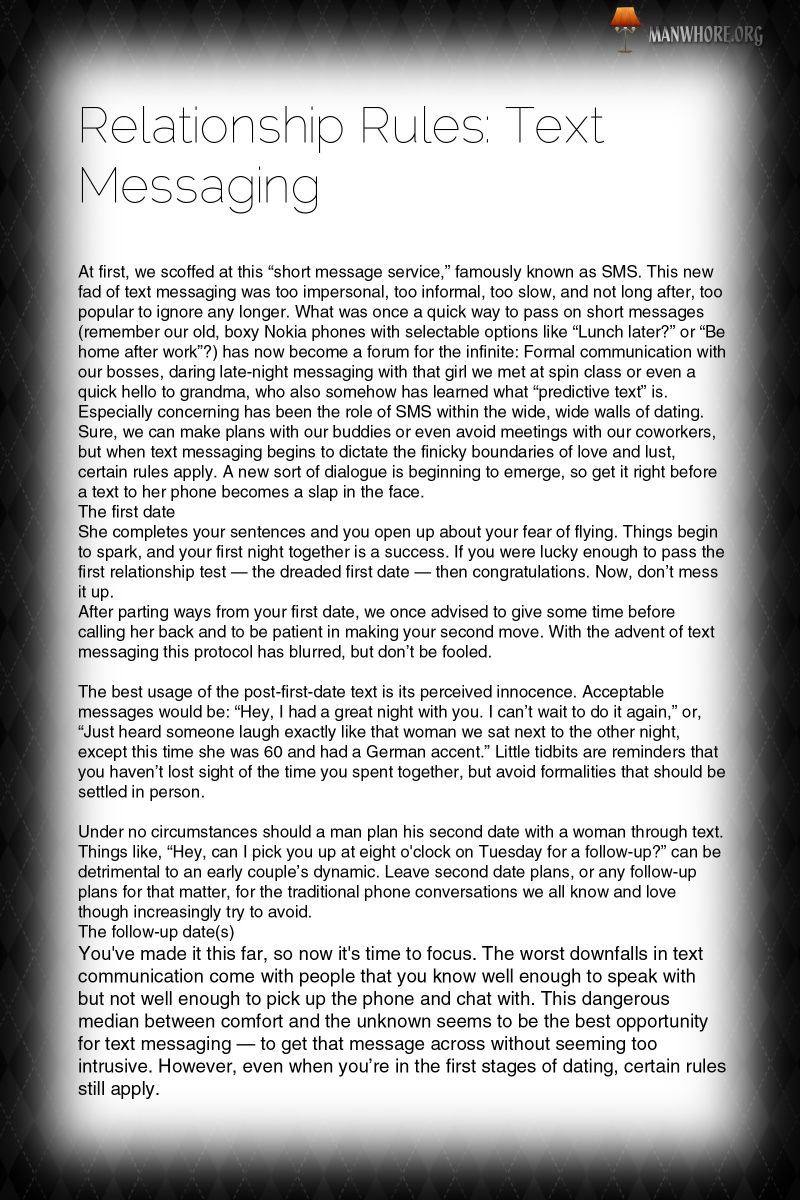
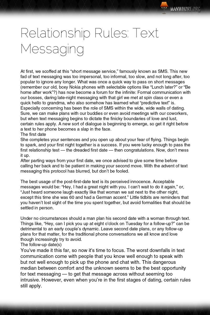
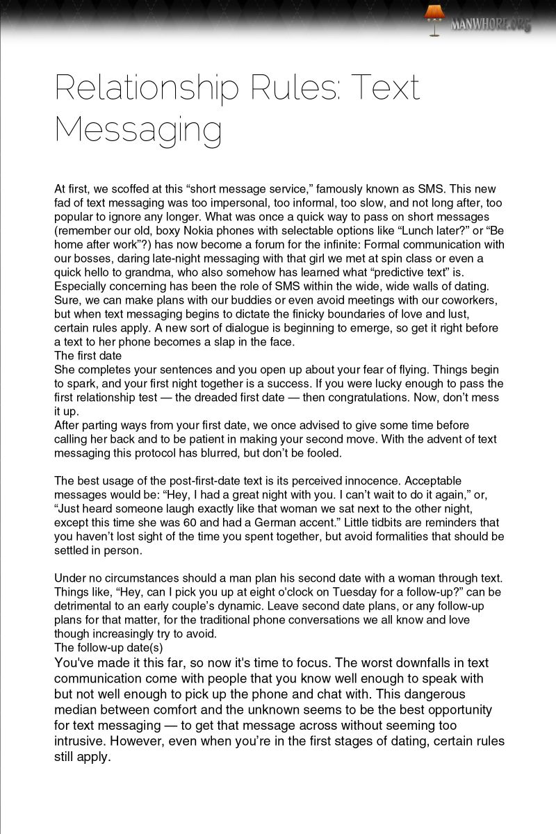
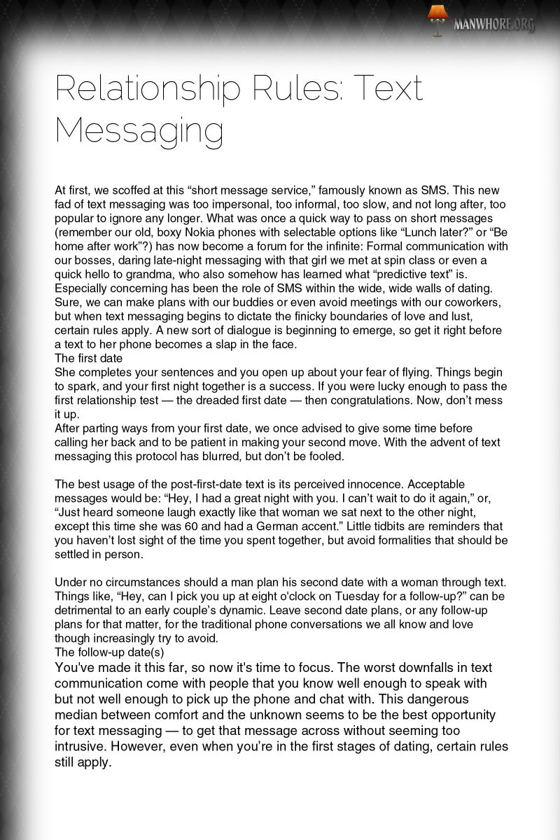
I really like the first two. The middle one is ok. Dislike the bottom two.
The faded black all around the border makes me feel like I'm reading something important/secret and it makes me want to sit down and read the book.
The bottom two remind me of the borders of a couple ebooks I read in the past that were basically scams. Gives me the same vibe as them.
I'm sure the other guys will have different opinions but thats my two cents.
Yeah I've got the same exact feeling mang.
I love the first two. The first one doesn't take up quite as much space so I think it's more functional.
I liked the second and third, they are more clean.
maybe put that shadow at the bottom too.
How's the 2nd one more "clean" than the 1st one?
Ow shit.. I counted wrong, my bad.. I'm out of coffee, spider sense is killing me.
The third one is perfect, shadow up and down.
Ow shit.. I counted wrong, my bad.. I'm out of coffee, spider sense is killing me.The third one is perfect, shadow up and down.
What do you think of the first two? I'm heavily leaning towards one of those..
I'd say the third one.
The second one the black fades too much into the text for my liking.
The third one is the easiest one to read out all of them cause of the symmetry. I'd choose the first one if was simply for aesthetics. And the third for readability.
I'd say the third one.The second one the black fades too much into the text for my liking.
The third one is the easiest one to read out all of them cause of the symmetry. I'd choose the first one if was simply for aesthetics. And the third for readability.
He said it all.
For reading I find the third one better.
You also could cut down on the shadows a little in the first one, so is like you are combining both.. I dunno.
Another vote for the third one. Its easier to read without all that stuff on the sides and the top/bottom still looks professional.
TheKing wrote:
Ow shit.. I counted wrong, my bad.. I'm out of coffee, spider sense is killing me.The third one is perfect, shadow up and down.
What do you think of the first two? I'm heavily leaning towards one of those..
First two are easily the best. THey look tight and very professional.
The other ones look like run of the mill
the first one is the best. The shadow boarders are less distracting as they are smaller. Numbered pages would be good.
The spacing between the title and the text is a bit big. Typography wise i like that you use sans-serifs fonts.
The third one and fourth one look clean and uncluttered.
1st one bro
¡Número tres es el mejor!
The first one. I like the best. If that's going to be the theme for the rest of the book. But if its going to be all blank I think the third one would be fine too.
The 1st one all day.
Interesting at least we've got some definite polarity going. The 1st and the 3rd. I agree with all points made I'm gonna go with the 1st for regular pages and I think Vyllainess has a point with the 3rd one being good for blank pages.


