What "Coloring Scheme" do you guys prefer..? Very important
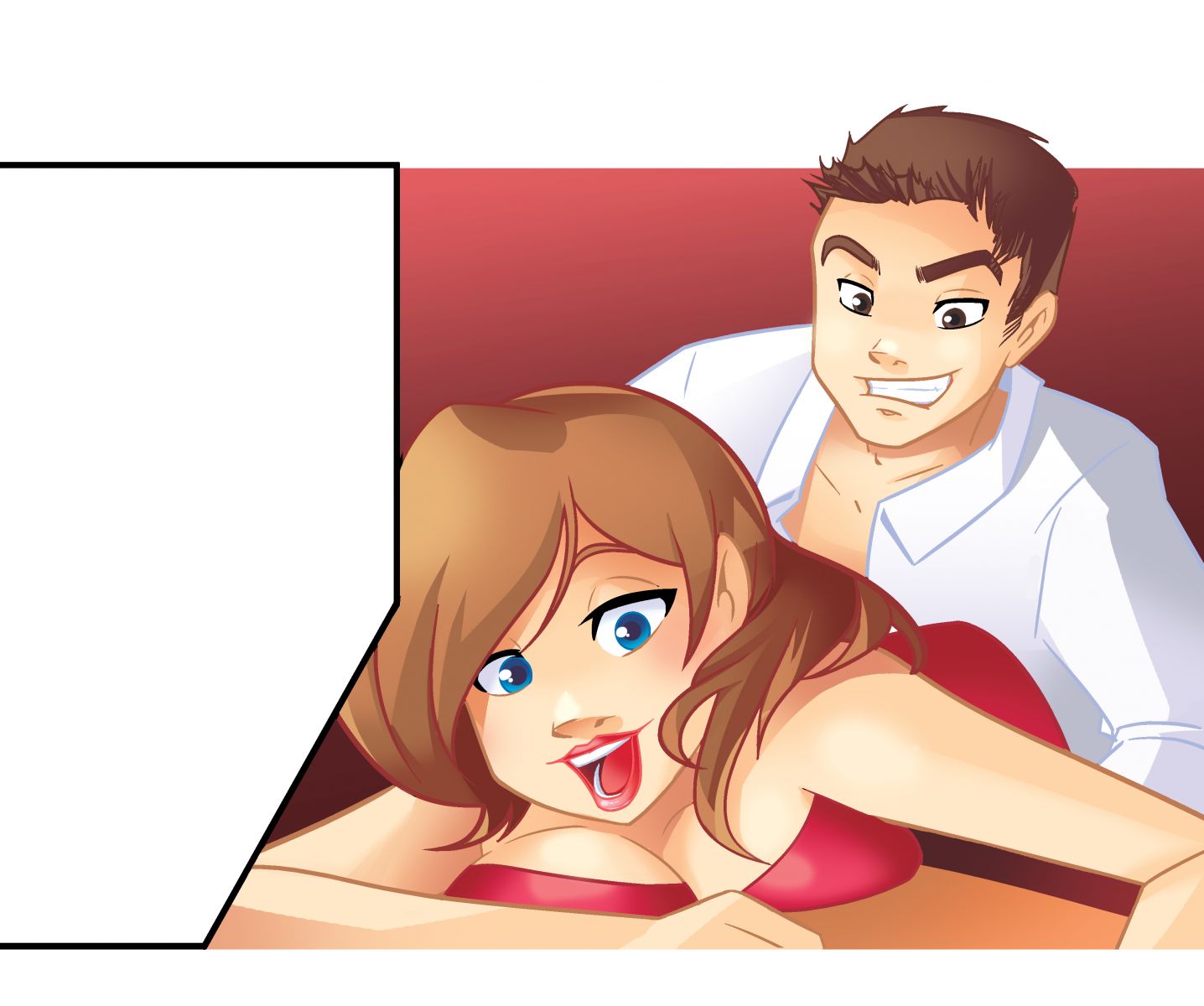
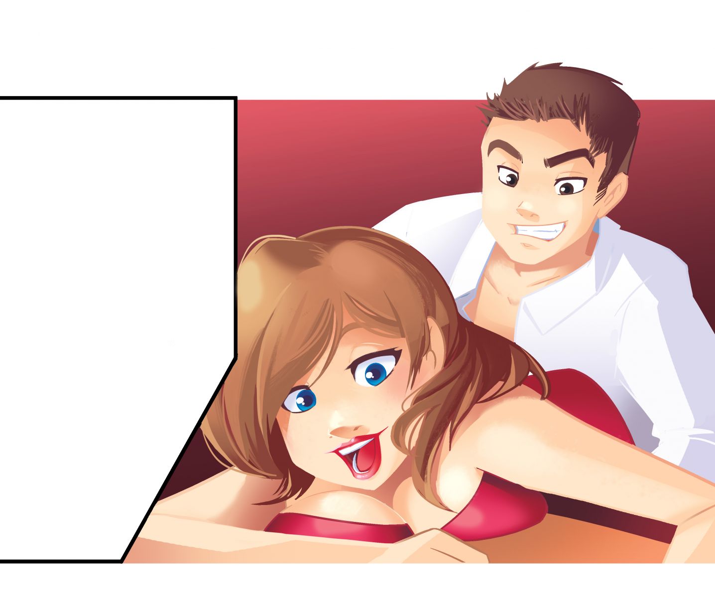
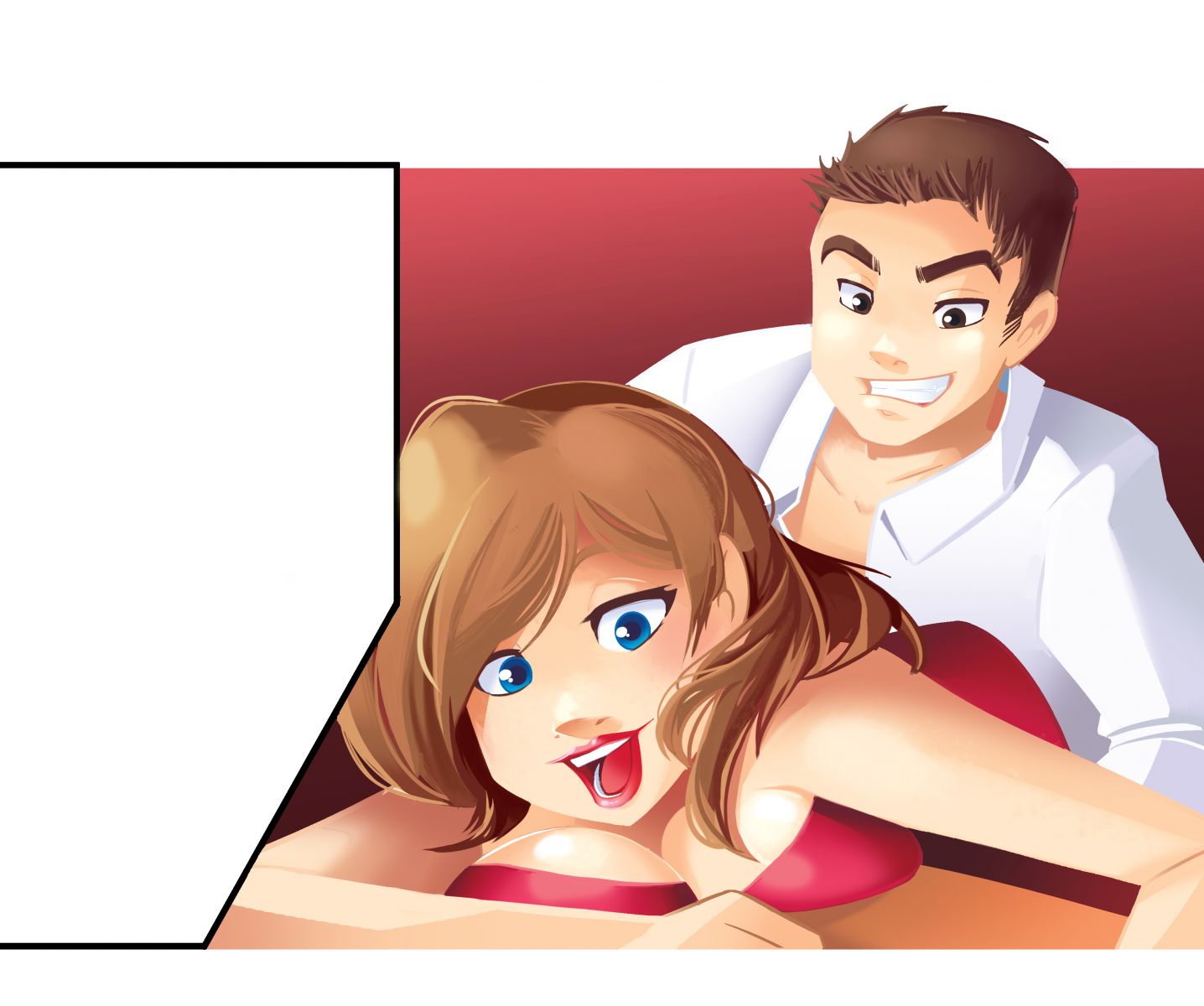
The one on the left looks more cartooony, the one on the right looks good.
The one on the left looks more cartooony, the one on the right looks good.
Ok I didn't realize it was displaying them like that, I fixed my wording. Which did you mean dude?
The one on the top is my least favorite. I like the one in the middle the most.
I'm in the process of writing a graphic novel (Something I've always wanted to do) so I do similar stuff.
The reason you're leaning toward the one on the bottom is because it's, technically speaking, a better piece of art. I'm talking about the little details, like the highlights in the hair are correct and the shadow/light areas on his shirt are correct in the bottom one. If you look closely, they're not quite as developed in the top ones. If you're paying the artist by the hour, those little details can add a lot of time to the project.
I shouldn't say "correct." it's all correct. It's just that the bottom one gives the eye more to see.
Yeah I spotted that, I didn't know what I was exactly seeing tho.
I am paying hourly yes, haha.
The third one also kinda reminds me of anime, which I like.
The third one also kinda reminds me of anime, which I like.
Me too... kinda reminds me of a disney porno I once saw
Why is your artist asking you which one you like better? It seems wierd to me, because the only difference between them is about an hour of work, probably less. Are they asking you how much you're wanting to spend?
No it's not like that. On projects like this I do a lot of micro-managing LOL. So I went through her whole portfolio and picked out different color styles
They honestly all look very similar to me. I don't know whether I prefer the second or the third, but I definitely don't like the first.
The way the shadows look in the first one I like. But the girl's head in the middle looks better. So Shadow (1) + Design (middle).
Hm I see what you're saying man.. do you think the shadows make the colors/pic look darker and maybe a bit sexier?
Right! Also, the girl's hair is more detailed in the 2nd one.
@MW YES! Not necessarily darker = sexier... Contrast is visually pleasing. For example compare image 1 and 3. Look at her armpit. More shadow there in #3. Look at her hair just above her left shoulder. More shadow. The highlights in the hair are more detailed in 3 vs 1 (or 2 for that matter). THATS contrast. Contrast is good.
It's all the same, doesn't anyone notice this? I feel like I'm taking crazy pills!
LOL! Or maybe you need to be on crazy pills!
Patrick, right click on each one and choose "open image in new tab".


