
What do you guys think of new manwhore.org? ? ?
It's a rough draft representation of the site. A lot of the text has just been filled in 'n such. Fonts, spacing, size.. all that's being worked on.

I go in and I'm crisp, clean and my vocals are fucking coming out like music. - Anonymous MW student
- Autismus Terminus Finis (Root Cause/Cure of Autism Epidemic)
- Called Off My Wedding & Other Turn Tail Signs Of The American Male
Hey fuckers I need your thoughts.
I go in and I'm crisp, clean and my vocals are fucking coming out like music. - Anonymous MW student
- Autismus Terminus Finis (Root Cause/Cure of Autism Epidemic)
- Called Off My Wedding & Other Turn Tail Signs Of The American Male
Haha man I think I remmeber where that iphone convo is from. Thats pretty hilarious.
Personally Im into more minimalistic webstites but I think its cool. I doubt im the guy to ask anyway.
The mobile site doesn't work properly. The text is all over the place. Haven't seen desktop version yet. But it kinda looks sleek
It looks a little on the mainstream side. What partially attracted me to your stuff was your website. It's edgy and when I got on there I was like, "alright this guy doesn't give a fuck I mean, look at his fucking website." Also Manwhore.orgasm needs to go back to being huge and dripping with juices again lol.
Also the rotating pictures of a girl handcuffed and a girl with her legs spread is a must. Idk where your head is at but I feel like this is the place where all the guys who just want to focus on getting laid with every girl on planet earth and in every bathroom stall on planet earth goes to because this website has that vibe to it.
Also the color black symbolizes power. Definitely throw more black in there. And it looks like you pulled the pictures from Christianmingle.com.
i think it's very eye catching...looking better then the actual version and it seems like content is much easy to find but don't get too flashy with it...after all...the content is the key...hope it helps

I like it
Looks really good. Don't like the blue'd out picture of the chick. On mobile doesn't look good. Looks well organized and easier to navigate than current site.
Doesn't work on mobile. But looks good otherwise

It looks a little on the mainstream side. What partially attracted me to your stuff was your website. It's edgy and when I got on there I was like, "alright this guy doesn't give a fuck I mean, look at his fucking website." Also Manwhore.orgasm needs to go back to being huge and dripping with juices again lol.Also the rotating pictures of a girl handcuffed and a girl with her legs spread is a must. Idk where your head is at but I feel like this is the place where all the guys who just want to focus on getting laid with every girl on planet earth and in every bathroom stall on planet earth goes to because this website has that vibe to it.
Also the color black symbolizes power. Definitely throw more black in there. And it looks like you pulled the pictures from Christianmingle.com.
+1
Its awesome, man.....it kinda makes you feel more curious to explore the content.

A lot of the text has just been filled in 'n such. Fonts, spacing, size.. all that's being worked on.
Great. I used to study (web) design years ago. Let's see if I can still be of any help.
The site looks all jumbled up on my Android Chrome on Sony Xperia Z2. On the PC, I think there is much clutter on the site. I mean, first of all there are so many colors. Ditch the white and change to black. For one, it's easier on the eyes. Secondly white is a great highlight color. Third, as someone said, black is a color of Power. Throw in red as well. That's also a color that reflects power, but also passion. You're the world's fucking best PUA/Teacher, black is mandatory for you mang.
- Ok, moving from colors to the structure of the front page, which is obviously more important. When a user arrives at the main site he/she immediately wants to know what that site is about. When he/she lands on your site it's like BAAAM! A hawt lady almost nude, who takes up the most space of all the elements and then there is a text saying "Get laid with your Skype coaching programme". So the "Get Laid" button up/right is redundant. You could possibly merge the two. We all know how big you are on establishing authority and masculine strength - you are one yourself. Your page MUST reflect that. I'm thinking the image of you with that blue shit going on is NOT doing you any justice. I mean, the way I see it, You are THE fucking beast, and you TRAIN people to be beasts - and these guys become WAY better than PUA's from other fucking companies. The page absolutely must reflect that, powerfully and without any clutter. I'd say that should probly be the focal point of your site. People need to understand the gravity of your awesomeness. Clearly you're putting more focus on getting people to train with you, which leads me to next point:
- Is there a kick ass local photographer who understands PUA and your whole angle on it that could take some portrait pictures of you? You need better images that reflect your authority bro.
- I barely see the "Learn how to Sext" text on my 1680*1050 res, which means that section doesn't exist.
- I recommend going back to the drawing board to reduce overall clutter and think about how to enhance the various elements and enhance clarity so your message comes across more effectively.
- I hate to say it, but I like the current version a lot more.
- My points are probly vague, but that's inherent with this field.
It looks a little on the mainstream side. What partially attracted me to your stuff was your website. It's edgy and when I got on there I was like, "alright this guy doesn't give a fuck I mean, look at his fucking website." Also Manwhore.orgasm needs to go back to being huge and dripping with juices again lol.Also the rotating pictures of a girl handcuffed and a girl with her legs spread is a must. Idk where your head is at but I feel like this is the place where all the guys who just want to focus on getting laid with every girl on planet earth and in every bathroom stall on planet earth goes to because this website has that vibe to it.
Also the color black symbolizes power. Definitely throw more black in there. And it looks like you pulled the pictures from Christianmingle.com.
Agreed.
Valuable feedback.
I go in and I'm crisp, clean and my vocals are fucking coming out like music. - Anonymous MW student
- Autismus Terminus Finis (Root Cause/Cure of Autism Epidemic)
- Called Off My Wedding & Other Turn Tail Signs Of The American Male
It looks a little on the mainstream side. What partially attracted me to your stuff was your website. It's edgy and when I got on there I was like, "alright this guy doesn't give a fuck I mean, look at his fucking website." Also Manwhore.orgasm needs to go back to being huge and dripping with juices again lol.Also the rotating pictures of a girl handcuffed and a girl with her legs spread is a must. Idk where your head is at but I feel like this is the place where all the guys who just want to focus on getting laid with every girl on planet earth and in every bathroom stall on planet earth goes to because this website has that vibe to it.
Also the color black symbolizes power. Definitely throw more black in there. And it looks like you pulled the pictures from Christianmingle.com.
This.
i'd streamline the articles part so it's just one column. you can put text over those pictures. after all that is one of the reasons behind this new overlay trend - photos look good even with text over it.
and that old "logo" seems out of place in this design.
What I'd change
Make your pic smaller and possible use a different one (that one of you on the horse is pretty badass)
New girl
The articles at the bottom make smaller and more of them per page
The top navigation bars are great
Thoughts:
-Pictures are too big
-Colors are all over the place, they don't really match or have any kind of theme going on. The site theme is the whole get laid thing obviously, but the colors are just too different
-Theres too much white
-I'm not a fan of that picture of you, on that page with those colors. I think it's awesome on the ad banner on this site cause the dark blue and black really kind of fits with the whole badass look you have going on in that picture. But with all the white/grey/"light" colors etc... I don't think that picture fits the vibe of the page all that well. It's a bit too serious. To me those colors are less heavy/serious and the picture of you should match.
-I'm not so sure about the whole "change your life" thing with the pictures of a sole naked chick on the page. I mean yes you're helping a guy increase his skills with women substantially and he'll get laid a lot more. But when I think of changing your life I think of changing your lifestyle as a whole. I would maybe post pictures of you or some guys with tons of chicks, at like a party or a bar or something. Or a video of you or some guys on some bad ass adventure sort of thing. Either that or maybe save the whole "change your life" line for the sales page of some kind of program where it fits the vibe better. I dunno to me changing your life goes beyond just getting laid. For instance, I dunno if this is true or not, but I've heard RSD instructors say Ryan of RSD is great with chicks, but he's also a real sad fuck. I dunno he's not a good example cause from what I understand he did massively change his life even if he still is sad a lot of the time. But yeah, I would post videos/pictures that reflect a large change in your life as a whole. Like a guy with pictures of him with multiple chicks or something else that reflects some kind of big change in his life. For instance, one idea would be to show via pictures, the underlying message that he has tons of chicks in his life now and has lots of options. When I think of getting laid, it seems more like a singular event, which isn't reflective necessarily of a massive change in your life. But that's just me, hopefully that makes sense.

What do you guys think of this pic? We don't have to use whole thing I'm just curious if you like the vibe of it. My cohost likes this one a lot but I've heard differing opinions.
I go in and I'm crisp, clean and my vocals are fucking coming out like music. - Anonymous MW student
- Autismus Terminus Finis (Root Cause/Cure of Autism Epidemic)
- Called Off My Wedding & Other Turn Tail Signs Of The American Male
Yeah dude. What's not to like about it?
I always liked it but I heard it was too douchey. Don't think it ever did well for online dating either.
I go in and I'm crisp, clean and my vocals are fucking coming out like music. - Anonymous MW student
- Autismus Terminus Finis (Root Cause/Cure of Autism Epidemic)
- Called Off My Wedding & Other Turn Tail Signs Of The American Male
I'd say it fits the vibe i am getting from your field reports
I'd say it depends on the colors you decide to use for the page. As is I wouldn't use it, I don't think you're showing enough emotion. I think the colors match a bit more of a happier vibe. I would use a picture like one of these:
![]()
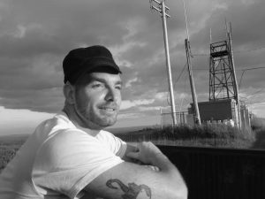
the first one is excellent but dunno about the second one. jon looks a bit like downie on that one lol :}
Yeah that was just some sales copy he threw in there. That's an interesting point tho.. even though the training is focused on getting laid it pretty much hits every aspect of a dude's life. I don't focus on fashion or hygiene at all, but becoming massively more self-expressive and passionate, able to speak and project louder and effortlessly, and being aggressive and proactive about women leads to the same thing in work and school and social status.
I go in and I'm crisp, clean and my vocals are fucking coming out like music. - Anonymous MW student
- Autismus Terminus Finis (Root Cause/Cure of Autism Epidemic)
- Called Off My Wedding & Other Turn Tail Signs Of The American Male
The pic on the site I dont think you look very badass or cool. In the pic of you with the two girls you look ridiculously badass and cool(its not necessarily because of the girls either).
Maybe you need a pic thats somewhere in the middle. df
edit: I like the pics rezznt posted more than the one on the site.
Thank you guys for the feedback. All you buttlovers. We're gonna have to change the pic and color scheme it seems..
I go in and I'm crisp, clean and my vocals are fucking coming out like music. - Anonymous MW student
- Autismus Terminus Finis (Root Cause/Cure of Autism Epidemic)
- Called Off My Wedding & Other Turn Tail Signs Of The American Male