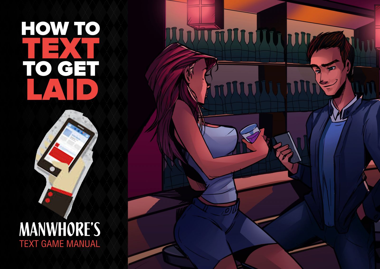
What do you guys think of this potential text game ebook banner/ebook cover?

I'm not sure it communicates the whole "text game" idea well enough? But it's definitely catchy.
My response assume in your book you state that text game is build on a solid interaction first, in face to face. Not from tinder or facebook etc.
The picture don't really convey the text game.
If I was you I will take more this one:

Or this one:

Maybe change the text in the portable to some hilarious one but this 2 are great and convey the message much more clearer.
I think go for a shot of girls face looking down at her phone in her hand with a laughing but wide eyed look. Like mind blown by what she's reading. If you do split screen have the guy looking at his phone with a smug smile, like I got this one
Wow yeah pretty much what he just drew up. Lol
Any more thoughts or ideas?
Yes I think we all agree the current one doesn't show "text game" well enough


