Which sales page do you guys think is better?
Or would you incorporate elements of one into the other maybe:
http://manwhore.org/membership/membership-page.html
or
I like the second one a lot better! I'm much more drawn into it and you're front and center so I instantly know it's legit and it's much more engaging.
Cool. Would you be able to describe in your own words what the membership was about and what kinds of benefits you would expect to receive from it after seeing the page?
The reason the second one is so much more hard-hitting is simply the styling of the text.
Much larger and clearer, also bolder. The dark red subtitles also section off the content well, and give it some structure.
The two column layout of the second one however has a much more choppy flow than that of the first and appears lop-sided content-wise.
The second ones background is pretty visually loud and disruptive.
I'm no expert on sales pages- but i'd assume that you don't want to have the potential customers eyes bouncing all over the screen- so the flow of the first works better for that. I'd put the "Get Instant Access" buttons each on a line of their own, give them some breathing space- maybe have them slightly more landscape oriented to kill the dead space. The first one seems to break down the services in more detail but more concisely (bullet points etc.), but the little blurb of the second is nice. There's other shit I'd say, but it'd just be nitpicking.
All in all, Format of the first, styling of the second, dial down on the red/black polka-dots.
The layout and arrangement of the first one is kindof amateurish. There's not a lot on there that would draw a viewer in.
The second one was decent. It could be a touch more professional, but only a touch. That's nothing some clever photoshop work can't fix. The 2 things that stuck out to me:
1. the red with black polka dots background. A little garish.
2. at the bottom theres a big blank space with nothing in it. With layouts, there should never be big empty spots in the content section.
Other than that looks pretty good!
LOVE the changes.
Thaat second is on point.
I bet you could make it even better, honestly. But wow, such a difference. I also like how the video automatically plays
'k Villain fixed both of those. Thankth buddhath
If I get time tonight or tomorrow, I'll whip something up real quick that you can use for that background to spice it up a bit.

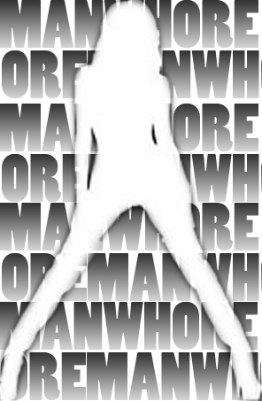
Try this instead of the polkadots. I dunno. This may be too distracting but try it out and see how it looks. I can tone it down if it is. Or do different colors or whatever.
Damn that's fucking hawt man. Wow
haha holyy shit
That's really good man.
Could you make her sporting a camel toe? Just kidding.. unless you really can
Ha! Its a silhuoette, so pretty much anything I did would make people think they came to a tranny website.
Wait...isn't that what this site is?? I'm confused
Right now my business is my priority, but I plan on getting some coaching from you when I can afford it...
Till then if you need any grapic design stuff, just lemme know. I'm happy to help you out if I can!


